


Table of contents
A modal is an element that pops up in front of other content on a website and disables the main page. Users must then complete some action on the modal or close it before returning to the main page.
Websites often use a modal to focus the user's attention on a particular action without interrupting the workflow of the main page.
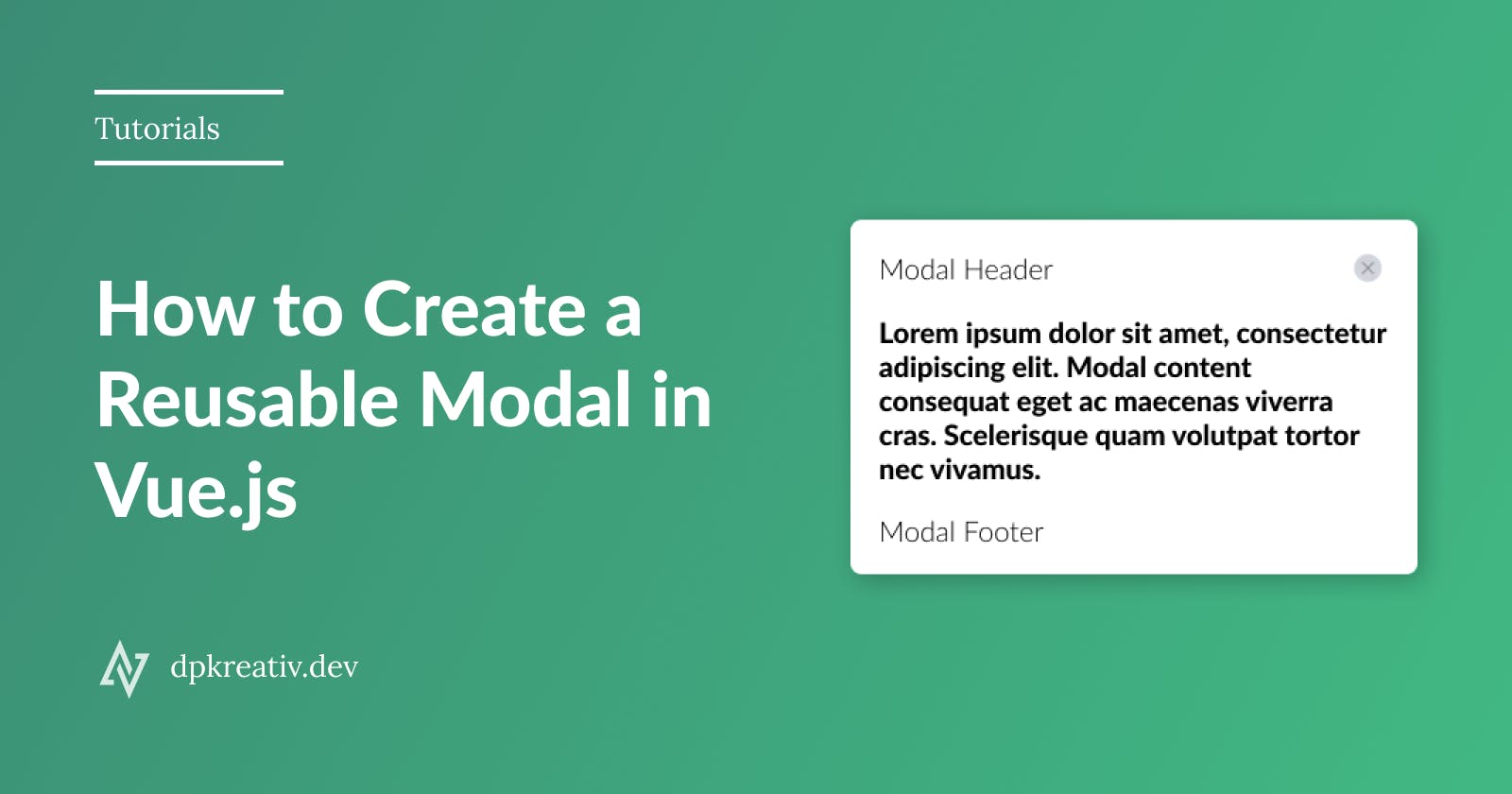
This tutorial will show you how to build a reusable modal component in VueJS and style it with TailwindCSS.
Tailwind uses utility classes instead of semantic classes. This means you can reuse class names on any part of your project where you're looking to achieve the same results. To read more about it, check this article.
This is a sample of what we will build:
Click here for a live demo.
Prerequisites
To follow this tutorial correctly, you will need the following:
- A basic understanding of JavaScript
- Node installed on your PC. It comes with its package manager (npm). Get the latest version of Node here
- Yarn package manager. Get it here
- Vue CLI
Setup Vue Project
Install Vue CLI
This package enables us to create Vue projects from our command line quickly. To install it, open your terminal and run the command:
npm install -g @vue/cli
or using yarn
yarn global add @vue/cli
To check the version of Vue you have on your PC, run this command:
vue --version
Create project
For this tutorial, we will name our project vue-modal. To start a Vue project, open your terminal and navigate to the folder you wish to create the project, then run this command:
vue create vue-modal
Choose a preset to determine the features you want on your Vue project. For this tutorial, we will choose Vue 3 with default settings for babel and eslint.
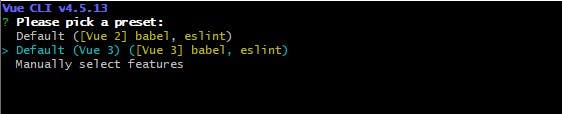
Press Enter on your keyboard, and wait for the CLI to set up the project for you automatically.
After Vue CLI has successfully created your project, navigate into your project folder by running this command in your terminal:
cd vue-modal
Install TailwindCSS
To install TailwindCSS in your Vue project, run this command:
npm install tailwindcss@npm:@tailwindcss/postcss7-compat postcss@^7 autoprefixer@^9
or using yarn
yarn add tailwindcss@npm:@tailwindcss/postcss7-compat postcss@^7 autoprefixer@^9
We are specifying the versions of the dependencies because there's an existing compatibility issue between tailwind and postcss; you can read more about it here.
Create configuration files for Tailwind and PostCSS
Configuration files enable us to customize TailwindCSS and PostCSS easily. Open your terminal and run the command:
npx tailwindcss init -p
The -p flag enables Tailwind CLI to generate a postcss.config.js file while creating its tailwind.config.js. These are the contents of the files generated:
// tailwind.config.js
module.exports = {
  purge: [],
  darkMode: false,
  theme: {
    extend: {},
  },
  variants: {
    extend: {},
  },
  plugins: [],
}
// postcss.config.js
module.exports = {
  plugins: {
    tailwindcss: {},
    autoprefixer: {},
  },
}
Configure TailwindCSS to remove unused styles during production
By design, Tailwind's development build is quite large, about 3.5MB. This contains all the possible classes and styles you might need for any project. Since you won't be using all of them, you can configure Tailwind such that during production, any styles and classes that are not used in the project will be "purged" out. This ensures a very light CSS file when you're ready to deploy your project, less than 10kb in size.
To configure, open your tailwind.config.js file and replace purge: [], with the following code:
purge: ['./index.html', './src/**/*.{vue,js,ts,jsx,tsx}'],
Add Tailwind to your global CSS file
In your src folder, create an index.css file and add Tailwind's base, components, and utilities styles so Tailwind can use these to generate a CSS file based on your configured design system.
/* ./src/index.css */
@tailwind base;
@tailwind components;
@tailwind utilities;
Import your CSS into main.js
In your src folder, open the main.js file, and import the index.css that you created earlier.
import { createApp } from "vue";
import App from "./App.vue";
import "./index.css";

createApp(App).mount("#app");
You have successfully set up Vue to work with Tailwind with these steps.
Set up the font for the project
We will be using Nunito from Google Fonts for this project. In your public folder, open index.html and add the code below to your <head> element:
<link rel="preconnect" href="https://fonts.googleapis.com" />
<link rel="preconnect" href="https://fonts.gstatic.com" crossorigin />
<link
    href="https://fonts.googleapis.com/css2?family=Nunito:wght@400;700&display=swap"
    rel="stylesheet"
/>
Start the dev server
In your terminal, run the command below to compile your Vue app in development:
yarn serve
Then open your browser and type localhost:8080 to see live updates to your project.
Let's now build out the modal 🚀.
Build Re-usable Modal
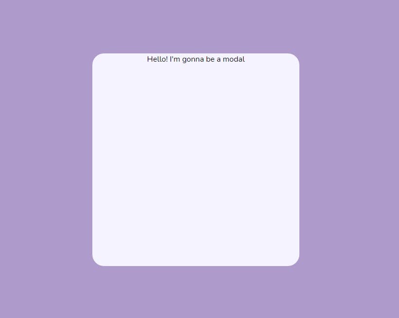
Create your Modal component
In /src/components, create a component named Modal.vue, then write some HTML template code and export it:
<template>
  <div>
    <!-- Modal Header -->

    <!-- Modal Body -->
    Hello! I'm gonna be a modal

    <!-- Modal Footer -->
  </div>
</template>

<script>
export default {
  name: "Modal",
};
</script>

<style></style>
Import your Modal component into App.vue
Open the App.vue file in your src folder, and replace the content of the file with this code:
<template>
  <Modal></Modal>
</template>

<script>
import Modal from "./components/Modal.vue";

export default {
  name: "App",
  components: {
    Modal,
  },
};
</script>

<style>
body {
  background-color: #f0f0f0;
}
#app {
  font-family: "Nunito", sans-serif;
  -webkit-font-smoothing: antialiased;
  -moz-osx-font-smoothing: grayscale;
  height: 100vh;
  text-align: center;
  display: flex;
  flex-direction: column;
  align-items: center;
  justify-content: center;
}
</style>
This will import our modal component so we can use it in <template>, and define the styles for the project's body tag and #app id.
Write function to display/hide modal
We want our modal to display when we click a button. First, we will create a button, then write a function that lets us display/hide our modal.
In App.vue, update <template> with the code below:
<template>
  <button
    class="bg-white py-4 px-12 rounded-xl shadow-md"
    type="button"
    @click="showModal"
  >
    Open Modal
  </button>
  <Modal v-show="isModalVisible"></Modal>
</template>
Here's what we did:
- We created a button with a white background (
bg-white), vertical padding of 1rem (py-4), horizontal padding of 3rem (px-12), border-radius of 0.75rem (rounded-xl), and a medium-sized box-shadow (shadow-md). For an in-depth guide to all of Tailwind's classes, refer to its documentation. - We added an
@clickattribute, which works the same way as anon-clickattribute in plain HTML/JavaScript. We set@clickto"showModal"; our function for displaying the modal on the web window. - In the modal component, we set
v-showto"isModalVisible".v-showis a boolean attribute in Vue that toggles an element'sdisplayproperty. This meansisModalVisiblewill be set totrueorfalse.
This is what the button looks like:

Let's now write our showModal function. In your App.vue file, update <script> with the code below:
<script>
import Modal from "./components/Modal.vue";

export default {
  name: "App",
  components: {
    Modal,
  },
  data() {
    return {
      isModalVisible: false,
    };
  },
  methods: {
    showModal() {
      this.isModalVisible = true;
    },
    closeModal() {
      this.isModalVisible = false;
    },
  },
};
</script>
Here we set isModalVisible's default value to false, then we create two functions:
showModalsetsisModalVisibletotruecloseModalsetsisModalVisibletofalse
Build and style modal
Open your Modal.vue file, and let's begin.
Modal Backdrop: We will add a div to overlay the main page. Update your <template> with the code below:
<template>
  <div
    id="modal-backdrop"
    class="fixed inset-0 bg-opacity-40 bg-purple-900 flex justify-center items-center"
  >
    <!-- Modal Header -->

    <!-- Modal Body -->
    Hello! I'm gonna be a modal

    <!-- Modal Footer -->
  </div>
</template>
Modal Container: Let's create the container for all of our modal's content. Update your <template> with the code below:
<template>
  <div
    id="modal-backdrop"
    class="fixed inset-0 bg-opacity-20 bg-purple-800 flex justify-center items-center"
  >
    <div
      id="modal"
      class="bg-purple-50 rounded-3xl overflow-x-auto flex flex-col justify-between w-2/6 h-4/6"
    >
      <!-- Modal Header -->

      <!-- Modal Body -->
      Hello! I'm gonna be a modal

      <!-- Modal Footer -->
    </div>
  </div>
</template>
Your modal should look like this now:
Modal Header: We will add a header to our component. Update <template> with the code below:
<!-- Modal Header -->
<header
    id="modal-header"
    class="px-4 py-6 flex justify-between items-center border-b-2 border-white"
>
  <slot name="header">Dummy header</slot>
  <button
      type="button"
      class="w-7 p-2 bg-gray-300 rounded-full"
      @click="close"
  >
      <img src="../assets/letter-x.svg" alt="close button" />
  </button>
</header>
In the header, we added a <slot> element and a button:
- Vue allows you to dynamically replace
<slot>with any content you want while using your component. You can read more about slots here. - We set
@clickto"close"in the button. - We will make
closea custom event usingthis.$emit()so that when the button is clicked, it will trigger thecloseModalfunction we created earlier. I also downloaded an "x" in SVG format, put it in the/src/assetsfolder, and added it to the button as an image.
Update your <script> with this:
<script>
export default {
  name: "Modal",
  methods: {
    close() {
      this.$emit("close");
    },
  },
};
</script>
Modal Body: We will create a <section> element, then add a <slot> for all the body's content. Update <template> with the code:
<!-- Modal Body -->
<section id="modal-body" class="px-4 py-6">
  <slot name="body"></slot>
</section>
Modal Footer: We will create a <footer> element, then add a <slot> for the footer's content. Update <template> with the code below:
<!-- Modal Footer -->
<footer id="modal-footer" class="px-4 py-6 border-t-2 border-white">
  <slot name="footer"></slot>
</footer>
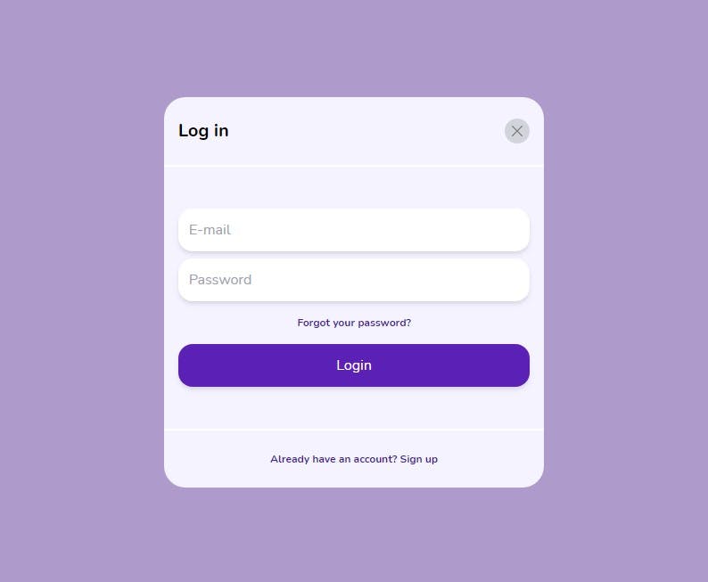
🎉 We have successfully created a reusable modal component! Let's fill it out with content based on the UI design we're working with.
Add Content to Modal
Navigate to App.vue and update <Modal> with the code below:
<Modal v-show="isModalVisible" @close="closeModal">
    <!-- header -->
    <template v-slot:header>
      <h1 class="font-bold text-xl">Log in</h1>
    </template>

    <!-- body -->
    <template v-slot:body>
      <input
        type="email"
        name="email"
        id="email"
        placeholder="E-mail"
        class="rounded-2xl w-full p-3 my-1 shadow-md outline-none"
      />
      <input
        type="password"
        name="password"
        id="password"
        placeholder="Password"
        class="rounded-2xl w-full p-3 my-1 shadow-md outline-none"
      />
      <p class="py-3 text-xs font-bold text-purple-900">
        Forgot your password?
      </p>

      <button
        type="button"
        class="rounded-2xl bg-purple-800 shadow-md p-3 my-1 w-full text-white"
      >
        Login
      </button>
    </template>

    <!-- footer -->
    <template v-slot:footer>
      <p class="text-purple-900 text-xs font-bold">
        Already have an account? <a href="#">Sign up</a>
      </p>
    </template>
  </Modal>
Here's what we did:
<template v-slot:{slot-name}>to add content for each of the slots we created in our modal component.- We used our custom event
@closeto extend the@clickevent in our modal component. We then added the functioncloseModalto it so that when a user clicks on the close button, it closes the modal.
And that's it 🎉.
Summary
In this article, we learned how to create a reusable modal in Vue and style it with Tailwind. Check out the source code for this project on GitHub. Please let me know in the comments below if you found this tutorial helpful. Thanks 🤗.